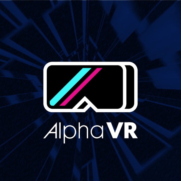
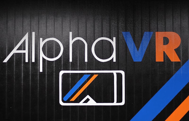
Alpha VR had a clear idea of what they needed: a logo that could transcend a language barrier between English and Japanese.
The logo needed to be illustrative and literal to avoid misinterpretation, and to reinforce understanding of the name of the company, which would not be written in Japanese. The text “Alpha VR” could not be embellished or deformed dramatically or risk becoming unreadable to non-native English speakers.
A stylized virtual reality headset icon was decided on. Depth was added to show it wasn’t just a large pair of sunglasses. The headset is black, matching most models of VR headset, with two diagonal coloured stripes reminiscent of retro video arcade cabinets.
Emphasis was added to the VR text to drive the message that the logo/business were centered in virtual reality.


